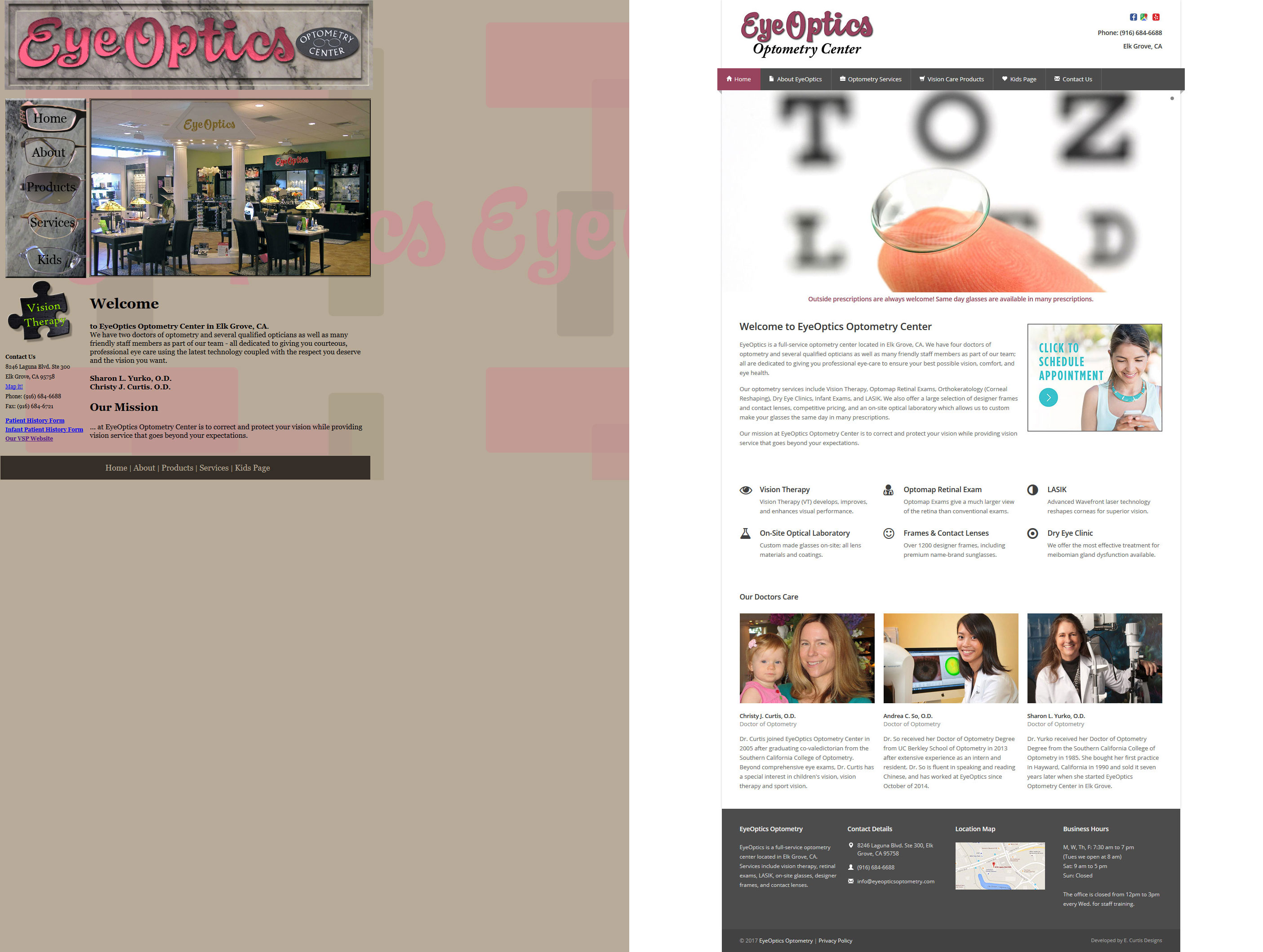
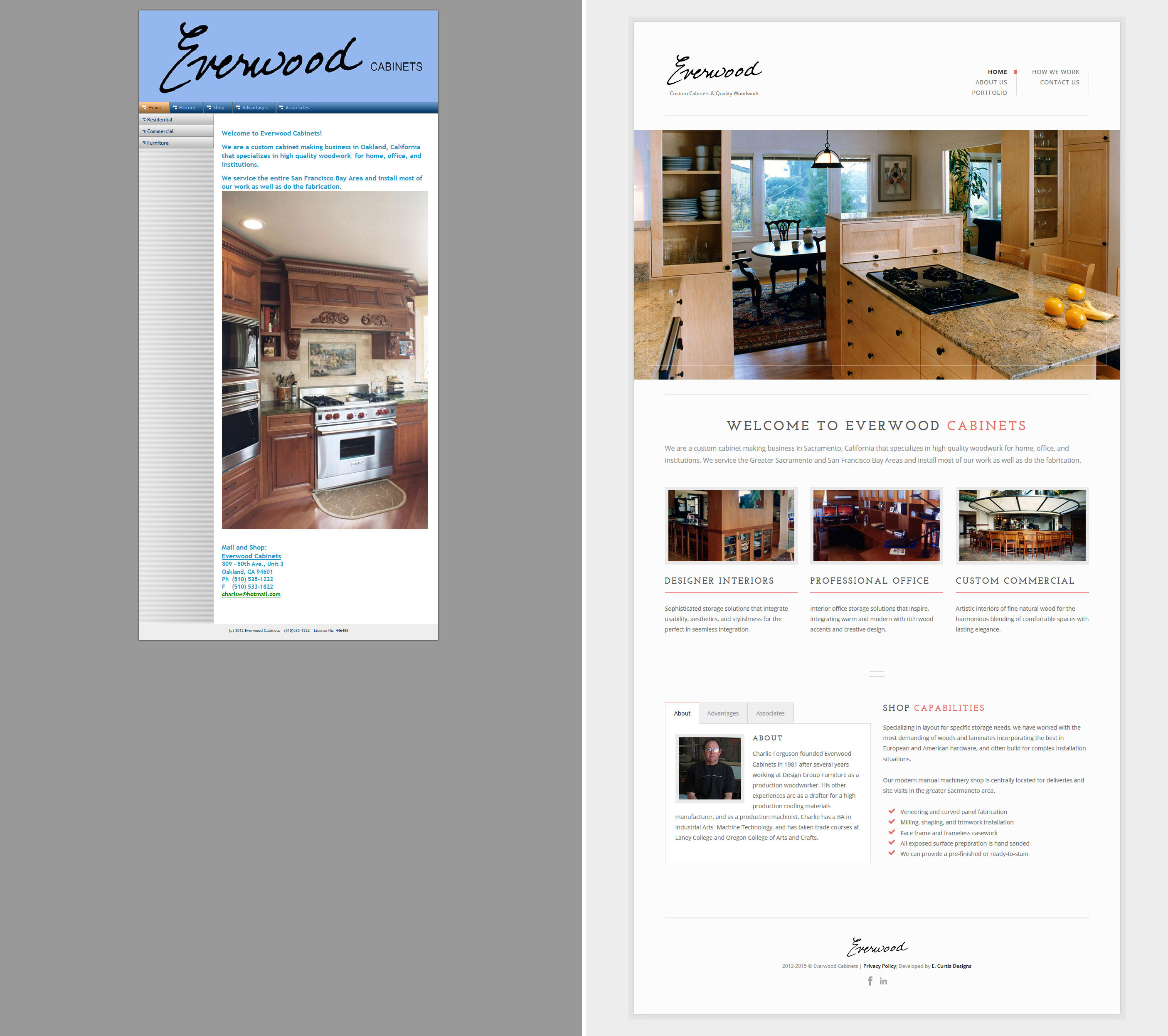
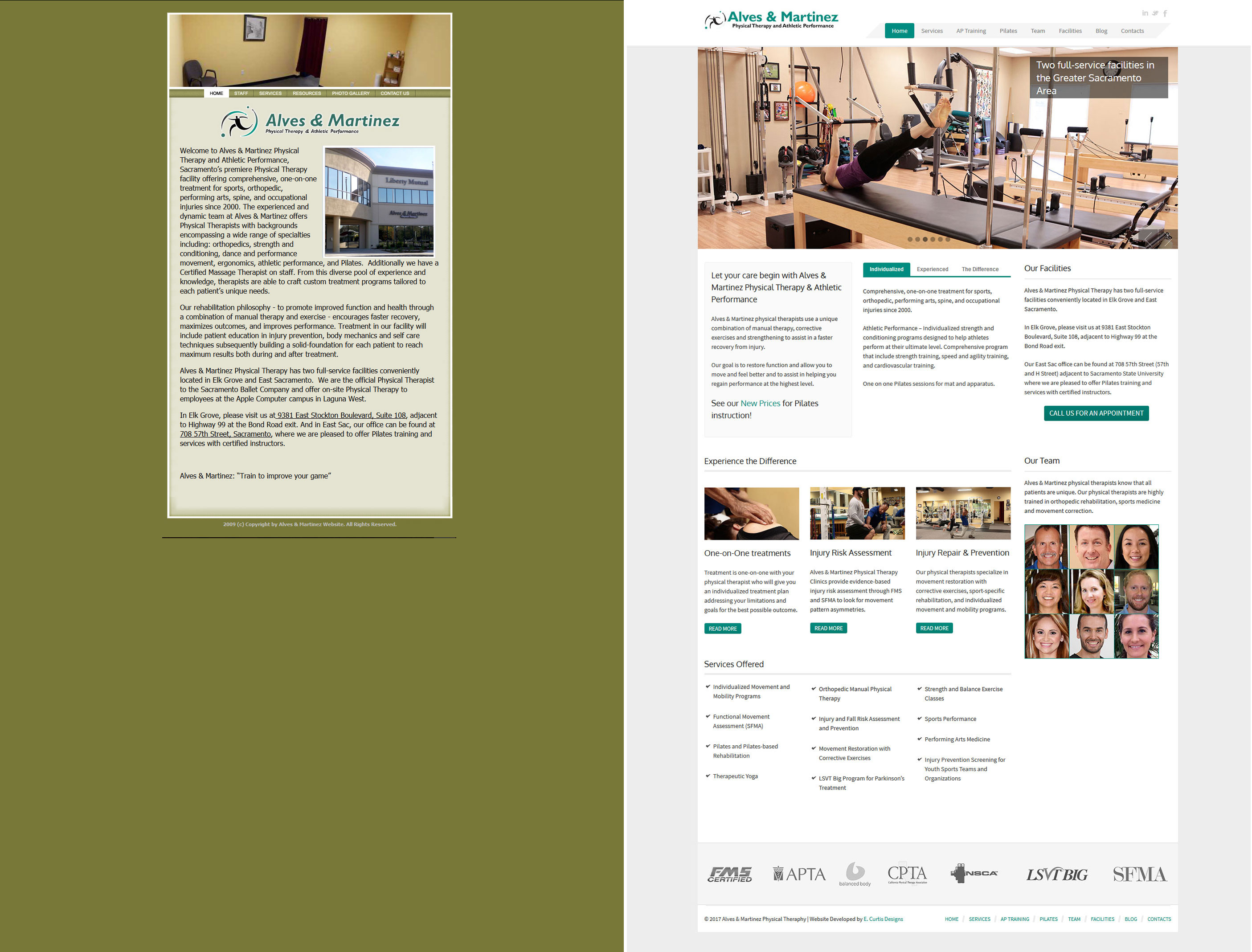
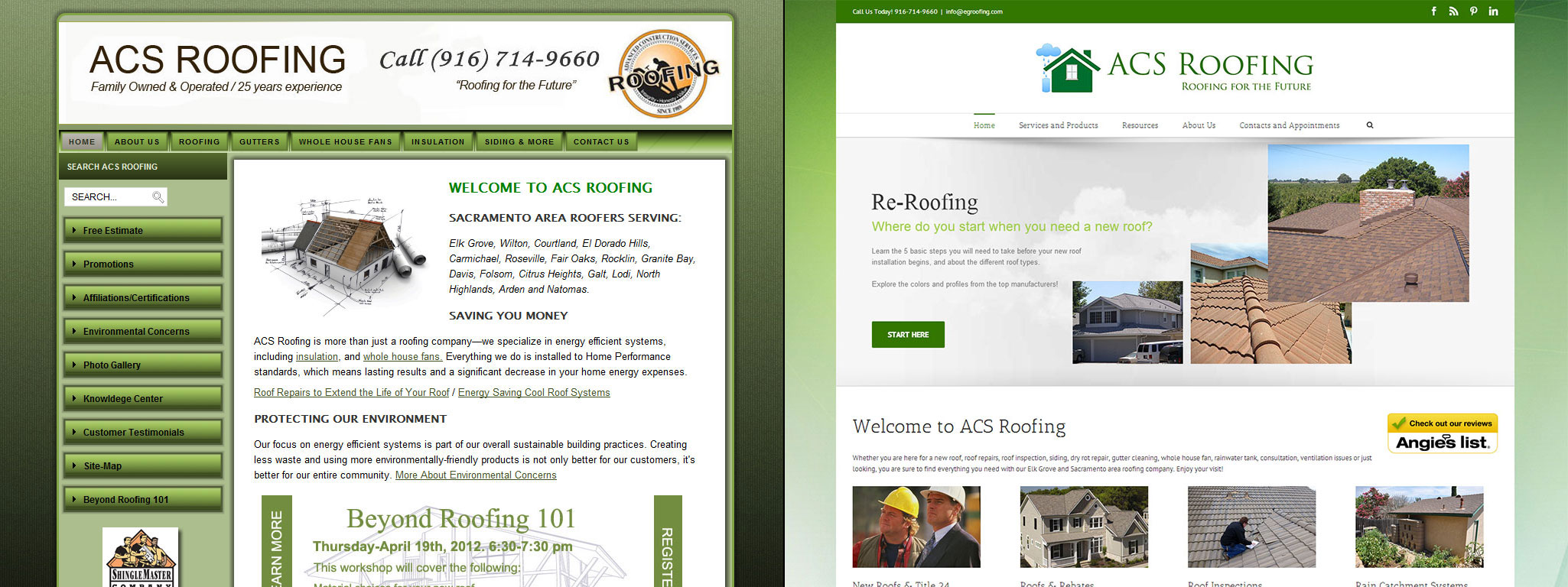
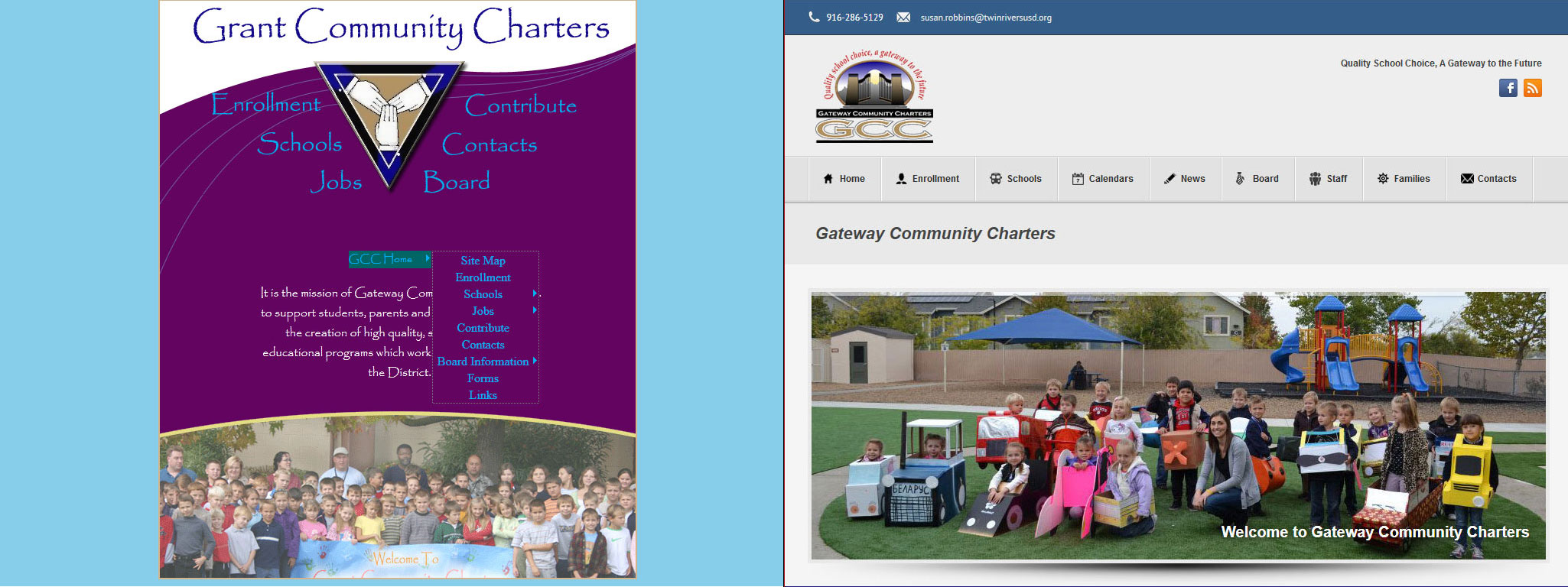
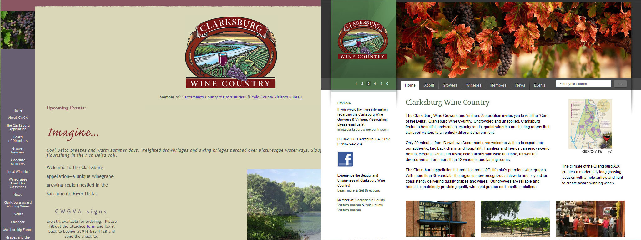
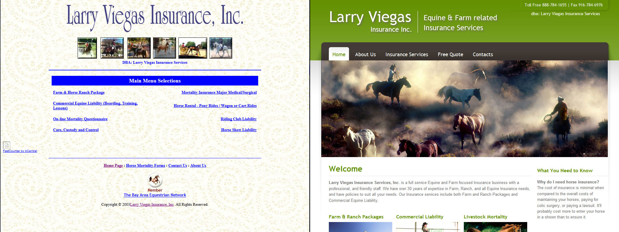
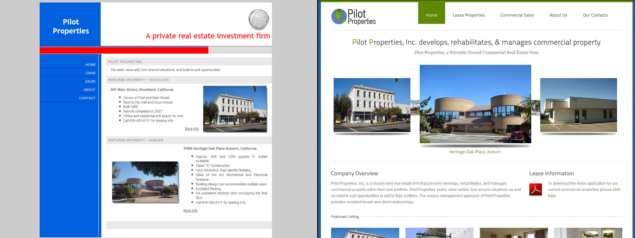
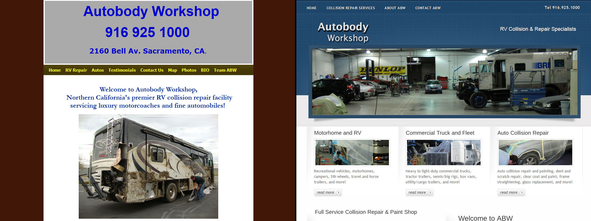
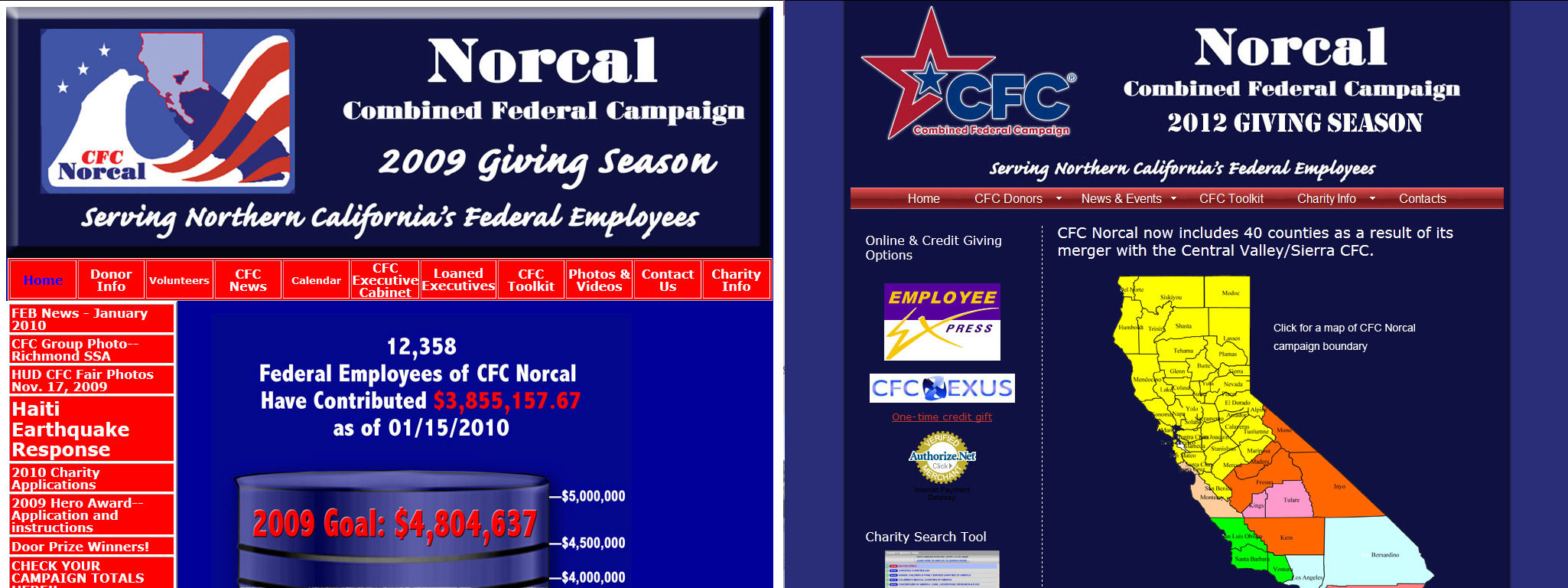
Web development is a changeable landscape which often results in a web page, even ones that were built well for the time, looking very dated after a few years. As a general rule most well-made websites will need to be redeveloped approximately every 5 years to be fully compatible with the latest internet browsers, mobility requirements, script security, and to take advantage of the latest features and styling options. Of course not all industries demand a professional looking website — the need for a full redevelopment will in many ways be defined by how your website compares to that of your business competition and what your target audience expects.

One of the most satisfying parts of our job is seeing the transformation of a web page to current development standards. We have provided before-and-after screen captures of websites we’ve redeveloped to illustrate the changes in design and specifically how a professionally designed website, utilizing current styling practices can drastically change one’s company image.

Layout Width Changes

The width of the design layout has changed a lot over the years.  When the first web pages were being designed they were created to fit well in a 600×480 px screen resolution.  In time this “default width” changed to 800×600 px, and then to 1024×768 px, From there layouts have been designed to look good in all resolutions by either using a full-width wrapper which sizes per the viewing device (responsive), or the layout container (known as “boxed”) is sized at around 1200px width, yet also responsive.  These first three examples are shown at 1400 px width and at their full-length for comparison purposes. The image at left is the original website’s home page, and the image at right is our redevelopment.

Eye Optics Optometry Center

The original website was sized at 825px width.  It is left-aligned, and uses a Flash header slideshow, and rollover graphics for the left navigation.  Upon assessment we felt that the logo was too large, the slideshow was better provided as jQuery since it is mobile friendly and does not require a plugin to view it, the navigation needed to be indexable, which graphics are not, and the text needed enough contrast with the background so that it could be easily read for all users.  In addition, the layout was too narrow by modern standards, and left alignment doesn’t look good in larger monitors.

Our HTML5 redevelopment in 2016 utilized a responsive layout, and includes a professional slideshow, modern yet approachable styling, effective image accents, an informational footer, and additional content on the home page for SEO benefit, and so that the page would look complete.

Everwood Cabinets

The original website was sized at 730px width.  It has a large logo header, left side-bar navigation, blue text, and a large image on the home page. Upon assessment we we felt that the logo was too large, the left navigation eliminated space unnecessarily, the blue text didn’t integrate well, and the large image (while nice in itself) didn’t effectively showcase our client’s designs.

Our HTML5 redevelopment in 2015 utilized a clean, responsive layout, and includes a professional slideshow, modern “stacked” navigation in the upper-right corner, service categories in a columnar layout, a services listing, and a tabular system to display supplemental content.

Alves & Martinez Physical Therapy

The original website was sized at 653px width.  It had a Flash header slideshow with blur transition, and rollover graphics for the navigation menu.  Upon assessment we felt that the slideshow lacked engagement and needed to be replaced with a jQuery slideshow for optimal compatibility.  Much of the page text included important services information, yet it was not effectively presented for the sake of engagement.

Our WordPress CMS redevelopment in 2013 utilized a responsive layout, and includes a professional slideshow with text overlay, modern styling, effective image accents to feature services and staff, tabular system for additional information (and SEO purposes), partner logos, and an additional footer menu for ease of access in mobile.

Layout Improvements

A good business layout requires the varied design elements to work in harmony together.  These include the page colors, where and how content is presented, the navigation styling, the use of images for engagement, content position and spacing, and how and where text is presented.  These next examples are provided to illustrate how modern design elements will improve how a business is perceived.

Case Study

Highway 50 Association

The Highway 50 Association’s first website was created by us in 2004. Our clients were happy with their site, yet since it was now 8 years old and very dated, it was time for a redesign.  The new XHTML design, created in 2012 (image on left), has a fun slideshow header, approachable styling, and jQuery lightbox image displays.

In 2021 we redeveloped their site a 3rd time with HTML5 (image on right) to take advantage of modern layouts and styling. The new site includes a homepage slideshow, galleries and lightbox images, a testimonial/reviews carousel, jQuery validated form, and its mobile friendly.

Case Study

Synectic Technologies

The first Synectic website was created by us in 2004. We redeveloped that website in 2008, and while it looked more contemporary, it utilized Flash for the header and navigation area which is no longer effective for SEO reasons.

In 2012 we redeveloped Synectic’s website a 3rd time (image on left) by creating a modern HTML5 site with a wider layout, with improve features and styling.  And in 2020 we redeveloped their site a 4th time (image on right).  The new website was created with the WordPress CMS, and includes a homepage slideshow, image carousels and lightbox images, engaging icon animation, advanced forms, and more.

Baydaline and Jacobsen LLP

Baydaline & Jacobsen, LLP

The original website was created with HTML4 by us in 2004, and it was pretty good for its time.  But of course a lot has changed over the last decade, and since we were still being used for periodic updates we encouraged our client to let us bring it up to current development standards.

The new site, developed in 2015, utilizes a softer blue color value for the sake of approachability, has a slight logo revision, a large jQuery slideshow with text overlay, a CSS styled drop-down menu, call-to-action buttons, accordion toggles, a tabular system, a contact form with Google map, and more.

ACS Roofing

ACS Roofing

The original website was created in Joomla by another designer.  Our concern with the Joomla layout was the “boxy” feel, inconsistent typography, the green color used, and the overall presentation of content.

Our redevelopment of 2015 utilized a responsive WordPress CMS design.  This new layout includes a jQuery home page slideshow with text overlay, accordion toggles, a tabular system, quote and contact forms, Google map inclusion, image gallery, and more.  Of course we also improved the text and graphics where possible, and created a new logo per client’s specifications.

Gateway Community Charters

Gateway Community Charters

The original website was created by a web designer and as you can see beyond the narrow layout, the text is mostly graphical and difficult to read since there is not enough contrast (note that ample text is needed for a good SEO ranking).

We initially redevelopment their website in 2008 which utilized a small slideshow, a CSS drop-down menu, an employees only area, with a custom professional layout that would integrate well with their new logo. We updated their site to a responsive WordPress CMS in 2014 to freshen up the look, and to better accommodate the staff’s need for private access pages.

Clarksburg Wine Growers Association

Clarksburg Wine Country

The original website was created by a web designer, and was being updated at least partly in-house. As you can see from the screenshot the layout is left-aligned, with cramped navigation and is visually very poor. The clients wanted an easy to use CMS so we redeveloped their website using WordPress.

The new CMS website, developed in 2012, has a slideshow on the header, an event calendar, classifieds page, news page (blog), and a portfolio gallery for the different member wineries.  The website is now being maintained in-house which has resulted in some layout inconsistencies.

Larry Viegas Insurance

Larry Viegas Insurance

The original website was created by a web designer using ASP includes for the header and footer. The layout is visually simple, and the thumbnail image accents didn’t provide much.

Our 2012 XHTML redesign uses a jQuery slideshow, a contemporary CSS menu, contemporary styling and quality image inclusions on each page, as well as sidebar navigation to present this company as a professional one.

Capital Orthopedics

Capitol Orthopedics

The original website was created by a web designer in PHP which made it difficult for most designers to work on it, for which we converted it into XHTML for editing.  In 2012 we were asked to do a full redevelopment.

For our new layout we chose to use a similar burgundy color since we felt that this was effective, yet we made our new design wider, and instead of images for links as the original website had we are using an ADA compliant drop-down menu. This website also includes video, 3D flip-books, and for the sake of initial engagement we added an accordion header for the home page which highlights the different services offered with images and descriptions upon mouse-over.

Pietro's Restaurant

Pietro’s No. 2

The original was created and updated by a designer, and as you can see the typography is less than ideal, and the layout, while okay, did not present this great restaurant as they needed.

The design we created in 2012 has a slideshow on the home page, jQuery lightbox image displays. a dynamic menu system, accordion menu displays, and an open bistro feel which we thought important. Truly a feast on the eyes!

Sierra Rock

Sierra Rock

The original website, which I imagine was developed several years back, was visually barren, and the images that were used in the portfolio section were small, and poorly labeled. The logo header was just too large, and the typography and content layout needed help.

Our 2013 revision utilized a responsive WordPress layout to provide an administrative interface for adding products, and includes a slideshow with text overlay, a clean navigation system, consistent typography, and larger image representations for products and pages.

Killer VoIP

Killer VOIP

The original website was created by a web designer who used GoDaddy’s website builder tool, and as you can see the layout is very simple.

Our redesign of 2012 utilized the same original bear graphic to accommodate their print marketing, yet we incorporated professional styling, animated red smoke in the background, a tabular system for providing more information, and a text slideshow on the header to ensure the client’s message was conveyed effectively.

Pilot Properties

Pilot Properties

The original website was created by a web designer, and as you can see the look and feel was less than engaging.

Our 2012 redevelopment uses a round-about slideshow, new logo created by us, jQuery lightbox gallery displays, and pagination for the different property views. Our goal of course was to provide a much cleaner and more professional look with an open feel that will encourage a visitor to browse.

SGMP Sacramento

SGMP Sacramento

The original website was created and updated by a web designer, and as you can see the design had a cluttered feel. We initially took over as the “updates” designer in 2008 and we improved the layout a lot.  In 2011 we were finally able to bring this website up to current standards.

Our redevelopment utilizes a large slideshow featuring images of Sacramento, and incorporates a 3 column layout as requested by the client. The sidebars are used for additional content such as featured events, social media, etc. The new layout is much more professional in appeal, ADA compliant, and easier on the eyes.  Our  redeveloped website received a 2nd place award recognition in their national organization.

Autobody Workshop

Autobody Workshop

The original website was created using Network Solutions’ web builder. As you can see from the image at left, this site did not reflect the professional nature of the business, and in addition to the lackluster visual layout, the content was often inconsistent in typography, and other styling elements.

Our redevelopment in 2011 utilized a professional slideshow, clean layout and styling, effective image accents, and better organization of content to ensure that this business would be successful.

CFC Norcal

CFC Norcal

The original website was created by their employee who had some HTML knowledge yet as the site grew the layout became too complex and visual inconsistencies became more common.

The Executive Director wanted a dark blue and red color scheme, so using the existing site as a color guide, in 2010 we created a new layout without “tables”  and utilized a CSS drop-down menu to ensure ADA compliance (very important for a Federal charity), and generally cleaned up the site to improve its professionalism.