First impressions online happen fast — often in less than three seconds. Visitors instantly judge a site’s credibility based on its visual appeal, and two of the biggest factors are typography and color. Your font choices and color palette don’t just influence readability; they also communicate your brand personality and set the tone for the entire user experience.
Good typography works hand-in-hand with design to create an engaging, trustworthy, and accessible site. The key considerations are:
- Readability – Fonts should be easy to read on all devices and screen sizes.
- Compatibility – Use widely supported fonts or web-embedded fonts (such as Google Fonts) to ensure consistent rendering.
- Brand Tone – Choose typefaces that match your brand’s personality (formal, modern, casual, playful).
For most websites, sans-serif fonts work best for body text, while serif fonts can add contrast in headings or special callouts.
Typography Best Practices
- Be consistent across all pages — same fonts, sizes, and styles.
- Limit decorative fonts to headings; body text should be clean and simple.
- Ensure strong color contrast for readability — light text on dark backgrounds or dark text on light backgrounds.
- Use bold, italics, and capitalization sparingly for emphasis.
- Maintain comfortable line height and spacing to avoid a cramped look.
- Load only the font weights and styles you need to improve performance.
Common Web-Safe Fallback Stacks
Even with modern web font embedding, it’s best practice to provide fallback font stacks for browsers that can’t load your primary font.
Sans-Serif
- Arial, Helvetica, sans-serif
- Lucida Sans Unicode, Lucida Grande, sans-serif
- Arial Black, Gadget, sans-serif
- Tahoma, Geneva, sans-serif
- Trebuchet MS, Arial, Helvetica, sans-serif
- Verdana, Geneva, sans-serif
Cursive
- Comic Sans MS, cursive
Serif
- Times New Roman, Times, serif
- Palatino Linotype, Book Antiqua, Palatino, serif
- MS Serif, New York, serif
- Georgia, Times New Roman, Times, serif
Monospace
- Courier New, Courier, monospace
- Lucida Console, Monaco, monospace
CSS Typography Essentials
- font-style: normal, italic, oblique
- font-variant: normal, small-caps
- font-weight: normal, bold, 100–900
- font-size: responsive units (em, rem, vw) over fixed px
- color: use hex, RGB, or HSL values for precision
- text-transform: capitalize, uppercase, lowercase
- line-height: improves legibility; 1.4–1.6 is common
- letter-spacing: adjusts character spacing
Color for the Web
Color has a powerful influence on user experience. The right palette supports brand recognition, guides attention, and improves readability. Poor color choices can make a site feel unprofessional, chaotic, or hard to use.
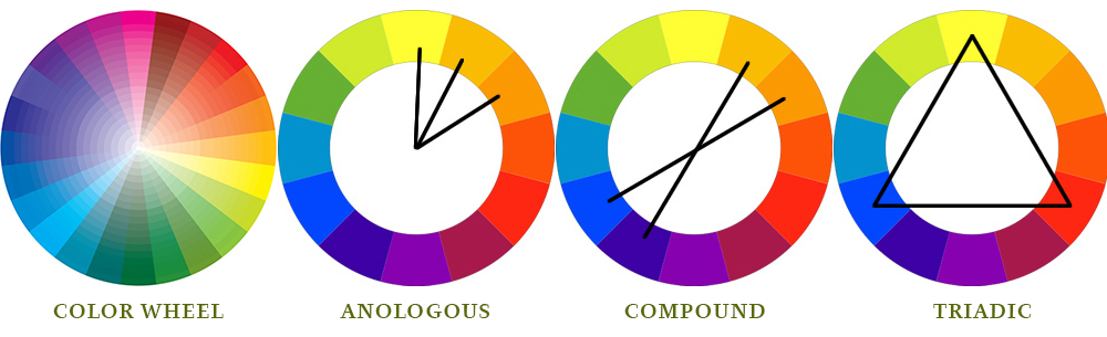
Three Common Color Approaches
- Analogous: Three colors next to each other on the color wheel (e.g., yellow-green, yellow, yellow-orange).
- Complementary: Opposite colors on the color wheel for strong contrast (e.g., blue/orange, red/green).
- Nature-Inspired: Sampling colors from photographs or natural settings for harmonious palettes.
Accessibility & Color Contrast
Color should enhance clarity, not create barriers. High contrast between text and background improves readability for everyone, including those with low vision or color blindness.
- Meet WCAG AA contrast standards (4.5:1 for normal text, 3:1 for large text).
- Limit palettes to 3–4 core hues for simplicity.
- Avoid relying on color alone to convey meaning — pair with icons or text.