General Layout Assessment
When reviewing sample sites, take notes on what works and what doesn’t:
- Color palette and contrast
- Typography hierarchy (headings, body, links)
- Navigation clarity, placement, and depth
- Header/hero/masthead treatment
- Logo placement and scale
- Imagery quality and consistency
- Content hierarchy and scannability (headings, lists, whitespace)
- Calls to action (visibility, clarity)
- Mobile experience (thumb reach, tap targets)
- Perceived speed/performance
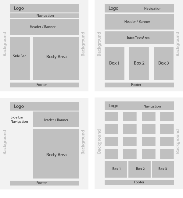
In our portfolio and gallery you’ll see a range of approaches. Most sites still use familiar elements—masthead or hero, navigation, body content (with or without sidebars), and a footer—but the choices around styling, spacing, and content emphasis create the real differences.
Layout Specifics and Considerations
Grid & Spacing: We build on a responsive grid with consistent spacing so layouts adapt smoothly across screen sizes and stay readable.
Hero / Masthead: Choose a single hero image, a static masthead, or a carefully curated slider. Short, meaningful slides beat long carousels; background video is used sparingly and only when it won’t slow the page.
Navigation: Keep top-level items concise. Options include standard top navigation (often sticky), simple dropdowns, or a mega menu when needed. On mobile, a clear menu button and comfortable tap targets are essential.
Page Structure: Full-width content works well for storytelling and imagery; sidebars are useful for supporting items (contact info, CTAs, related links). Be consistent with sidebar placement across pages.
Imagery: Use quality business images with consistent aspect ratios. We optimize sizes for speed and include meaningful alt text for accessibility and SEO.
Social Elements: Icons can live in the header and/or footer. Larger placements (e.g., an embedded feed) are used only when they add value.
Footer Content: Common inclusions are company details, service areas, quick links, social icons, and concise trust signals (licenses, memberships).
Microcopy & CTAs: Short helper text (“what happens next”) and clear calls to action guide visitors and improve conversions.
Forms: Keep them short. Use validation and spam protection. For complex requests, multi-step forms can improve completion rates.
Modern Best Practices
Mobile-First & Responsive Testing: Most visitors are on phones. We design for mobile first and test across real device sizes—not just resized desktop windows.
Accessibility & Inclusive Design: Good color contrast, keyboard-friendly navigation, descriptive alt text, and clear focus states help everyone and align with ADA/WCAG guidance.
Performance: We prioritize fast loads with optimized images, smart caching, and minimal scripts. Speed improves user experience and SEO.
Content Hierarchy & Scannability: Clear headings, short paragraphs, bullet lists, and thoughtful whitespace help visitors find what they need quickly.
Engagement Elements: FAQs, testimonials, highlights, and light motion can add clarity and personality—used intentionally so they support (not distract from) your message.
Content Best Practices
An effective page is as much about placement as it is about prose. We recommend:
- Balance content across columns so sections feel complete (avoid lopsided columns).
- Prefer left-aligned text for readability; avoid full justification.
- Use headings and bullet lists to make key points scannable.
- Right-size images for the layout; avoid oversized inline images that crowd text.
- Provide breathing room—consistent spacing around images, cards, and sections.
- Use color and typography consistently; maintain strong contrast for legibility.
- Keep effects (bold, italics, all caps) purposeful rather than decorative.
- Aim for enough imagery to support the story—without overwhelming it.
- Proofread for clarity, spelling, and grammar. Clean copy reads as professional—and helps SEO.
💡
Pro Tip: Even small layout details—like consistent button styles, microcopy that guides visitors, and clear calls to action—can make a big difference in how professional your site feels and how effectively it converts visitors into customers.